SILO27 Dev log 2

It’s been a while since the last one 🤔 so there’s a lot to talk about. Buckle up!
Hover car
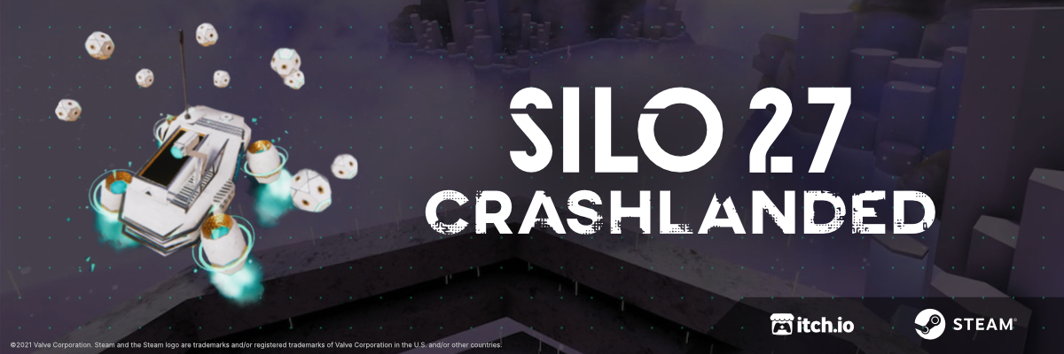
The major change has to do with the hover car. It was completely reworked, everything was done from scratch. The videos below show some weird stages of the progress. The fifth video is the final result. Overall the changes from the previous implementation are better controls and handling. The new version is much harder to flip, the old one needed just a tiny rock and it was on its head. The UI consists of just a clean and minimal power bar that charges up in the back of the car. The power of the car can be utilized for short boosts or a jump. The latter completely depletes the power and you have to wait for it to recharge to regain control of the vehicle.
Interaction
Another thing that got a big rework is interaction. The UI is very minimal and contextual. The cursor only shows when you get near stuff with which you can interact.
Rocks
 Trying stuff for rocks. These are handsculpted in Blender. More about these in the next update.
Menu
Here’s a sneak peek of how the menu will probably look, except it won’t. The goal was to put everything in one place while having it still accessible with keyboard shortcuts. There’s also one video of the initial stage of some sort of map. This will very probably change quite substantially in the future but for now, this is where we’re at.
Bonus concept art


